Berenice Abbott

Berenice Abbot was an American photographer who is well known for her photographs of architecture and urban designs in the 1930’s. Abbot approach to photography was very straight meaning she believed in the importance of photography’s being un edited both during and after the process. Through her career she displayed the rise in development of technology and society and she believed that the invention of the camera deserved to document the 20th century.
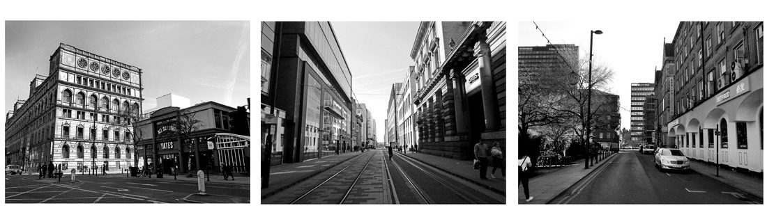
This is one of her images which was taken in New York. There aren’t many people shown in the street however there are cars and shops. The image is in black and white which displayed the time the photograph was taken as coloured photography wasn’t as popular as it is today. The black and white gives the image a really nice contrast look allowing you to see all the shadows and light areas in the image. The contrast in the image becomes less the further back through the street. This gives the image a bit more feeling of depth with thin the image. The tall buildings give the illusion that the street is very narrow but in fact when you look at the car sizes the street isn’t actually that narrow. The buildings also give the image a very tall vertical feel to it drawing your attention up through the image. Most of the lines in the image are very straight and there aren’t many curves in the image except for the road and small details. This gives the image a slight dynamic look. The windows on the buildings take up a lot of space within the image giving the image a very repetitive look.
The image gives off a very calm mood because of how quiet and peaceful it looks. Usually when thinking of New York, you get a very busy and crowded image but this is quite the opposite. The black and white also adds to this affect because it lessens the amount of things going on in the image compared to if it was full of bright colours. I think Berenice Abbot is trying to document and show the style of American architecture. Her work is made for everyone to see and for people in the future to be able to look back on and see what the place looked like then.
Berenice Abbott's Work


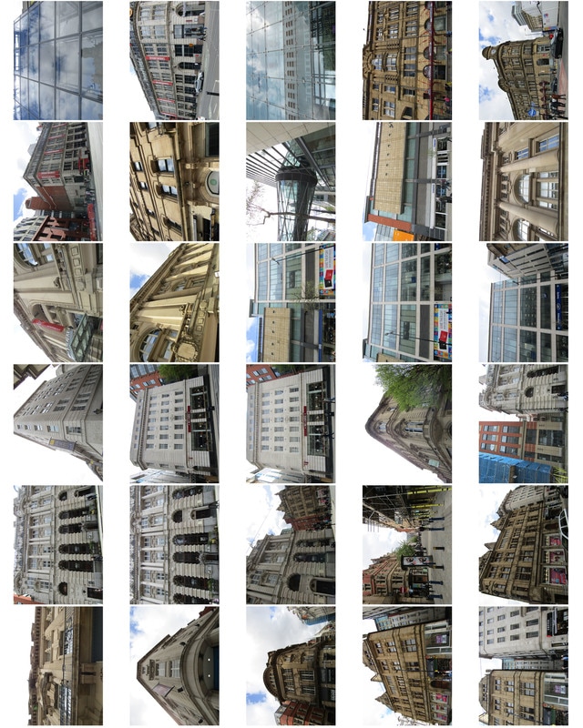
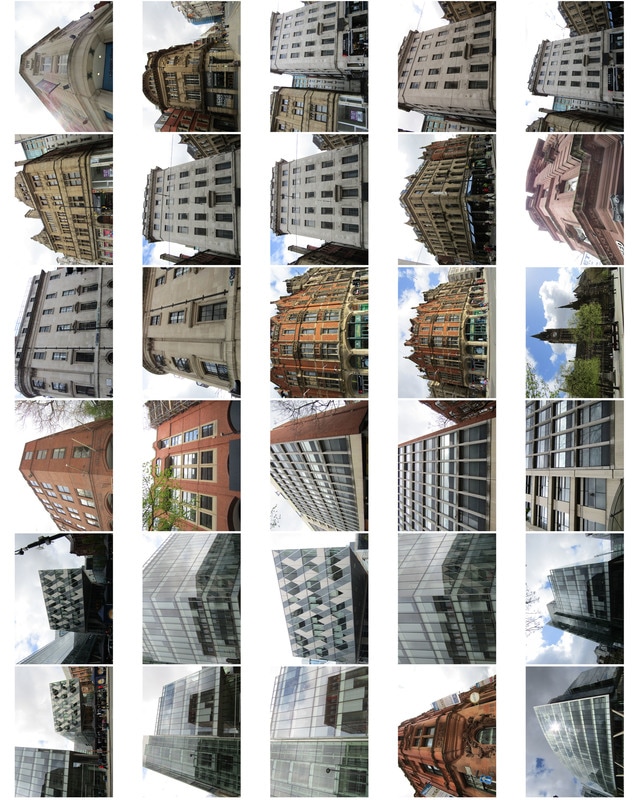
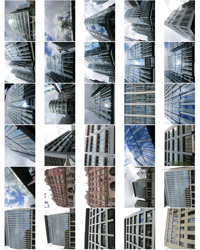
Contact Sheets


Edits


Hanging Plan
I would display these images like this because the image at the right is heavier on the right side of the image and similarly the left image is more heavy in the left side of that picture. The image in the middle is very centrally draw making it draw your attention to the centre which balances out all three of the images.
Further Edits


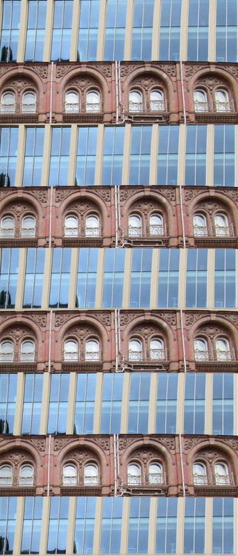
Development - Michael Wolf

Michael Wold is a German artist and photographer who mainly works in Hong Kong and Paris and focuses on life in the big cities. This is one of his images which is part of his study of Hong Kong. It is an image of a building in Hong Kong. At first glance the image looks like it’s been stretched and edited to make it look that way, giving it a very abstract look. However, the image hasn’t been edited at all. When you look closely at some of his work you can see small parts of human life such as objects on the balcony’s. The images he takes are displayed as 48”x64” or sometimes 70”x90”. This makes the image very interesting as when you are far away you see the image as more of a pattern but when up-close you can see the details and this makes you relies there is actually people living there. This displays the reality of how crowded and populated these big cities such as Hong Kong are.
Michael Wolf's Work


Contact Sheet
Edits


Development

Further Development


